
graphic design | spring 2019
architecture lecture
series poster
Goal: apply self-designed modular typeface to architectural series poster. Poster needs to be visually bold and expressive at a distance, and clearly organized and intelligible up close.
Process /
Initially with this poster, I knew that my modular typeface was more for display and less for text type. Therefore, it needed to be used decoratively rather than to present information. Because my modular typeface was nontraditional, I had to find a way to bring structure to the page while also letting the typeface’s personality shine through. As a result, I placed emphasis on the letters and their organic forms through scale and color.

Through several iterations, I realized that I was being timid with using my typeface and I started to utilize more characters in order to make the composition more interesting.
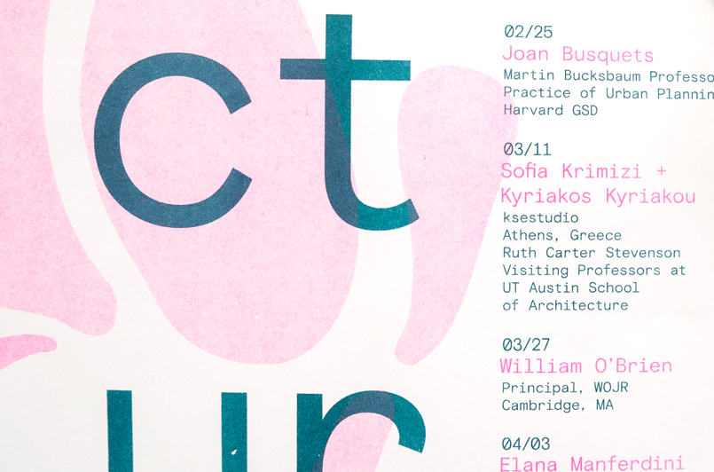
When I wanted people to see this poster, I wanted them to notice the text in the background first and then the bigger information like what this was: a lecture series. Then, what semester it was, the dates it ran, and the time in which the lectures started. I thought that this secondary information was imporant to emphasize because it was a commonality for all of the lectures — they all started at the same time and all fit within this timeframe. I did not want to be repetitive by adding these to every single lecturer’s information so I decided to do this instead. It was also important to me to keep the information in columns to ensure it was legible and easy to follow.
I decided to utilize a monospace typeface for the text type, Basis Grotesque Mono by the Colophon Foundry. The reason why I decided this was because the typeface that I designed was very loose and free and I thought that bringing structure to the composition somehow would make the composition stronger and differentiate information visually. To further create hierarchy, the different locations were in capslock and bolded meanwhile the names of the speakers were at a slightly larger point size.
Throughout this process I was not entirely set on the colors that I would use because of the printing method chosen but I did know that I wanted it to be duo-tone to differentiate information so that it would be easier to follow along with the large sum of information that was on the page. I decided to use a maximum of two colors and white in order to achieve this. To go further, I altered the intesity or opacity of the background type in order to provide more clarity on the smaller text.

Risograph Posters /

I designed two versions of the poster. The varying layouts for the varying colors used.
It was printed on the risograph printer. I ended up choosing the colors that I did because of some trial-and-error prints on the risograph printer and found some intentionally nice combinations. On the first poster I used pink coupled with the teal and the second poster used blue coupled with teal. To keep the two posters consistent I did use teal on both.
The reason why I chose to print two different posters was because of the varying layouts. The pink and teal poster has more structure to it whereas the teal and blue poster is a little bit more playful.
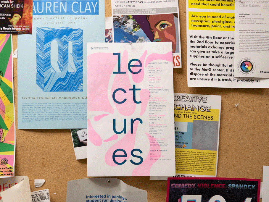


The modular typeface letters had varying opactities in order to allow better legibility but also create contrast.
