graphic design | spring 2019
peaches:
modular typeface
Goal: design a modular typeface by creating an alphabet using only a small set of basic geometric shapes. Then apply it in the design of an architecture lecture series poster.
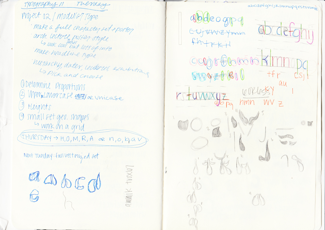
Process /

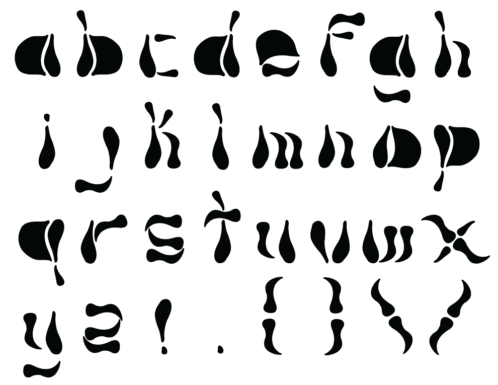
Most letters of modular typefaces have the same width or height and this norm would not be attainable with my typeface due to the free and organic nature of my idea.
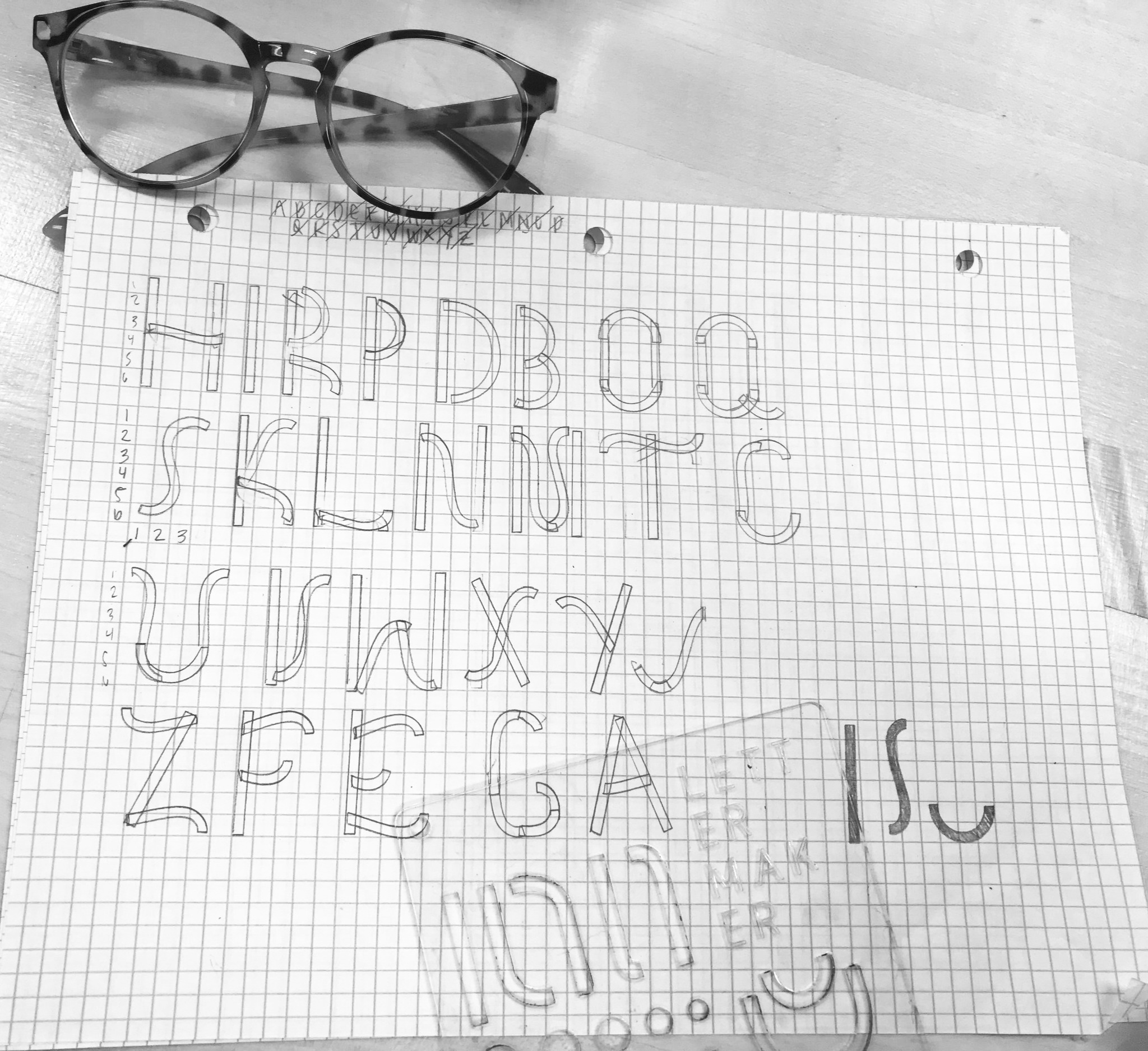
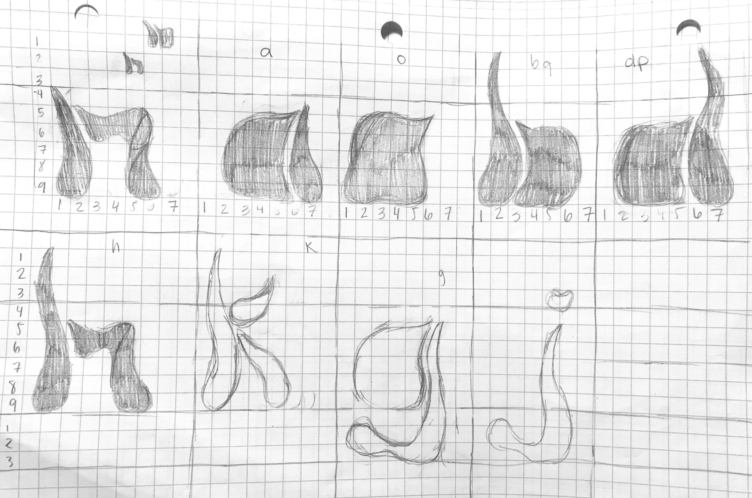
The purpose of this section was to make a modular typeface with as little shapes as necessary. Modular typefaces have fixed modules and strict systems, it is essentially a puzzle-piece process to make a letter. The typical modular typeface is fairly geometric so I wanted to challenge myself by constructing this modular typeface of organic shapes and no straight lines at all.
A challenge that I ran into was representing each letter legibly and so that they would be quickly recognizable. In order to create consistency among the letters, I decided that several of the letters would have similar structures (i.e. using the same modules for the stems of the letters). This can be seen with the letters b, d, h, l, k, p and q. They are all the same ascender/descender height. As for the width of the letters, they are not entirely consistent but they all fit into the grid in such of a way where they do not pass a certain measurement. A lot of work went into repeating shapes for portions of the typeface (i.e. the bowl of a letter being consistent but flipped).
The Five Modules /

Initially, I wanted to work with only five modules and make things work with only five modules but I ran into issues representing every single letter clearly so I had to change up one of the initial shapes to look like a dot that would accent letters.

The proportions of these letters would be considered normal but somewhat extended due to varying widths of the letters. The font is all lowercase and includes some punctuation marks.
The Final Set /

The Name /
The name of the typeface came from random words that I typed out for a critique. A lot of my peers thought that the typeface looked similar to bones or gave off the essence of halloween due to the colors that I used.
I decided to go with the name Peaches because it fit into this idea that I had initially with the free-flowing movements that I was inspired by for the typeface. The smoothness and fun of the typeface that breaks out of the norm for a modular typeface.