
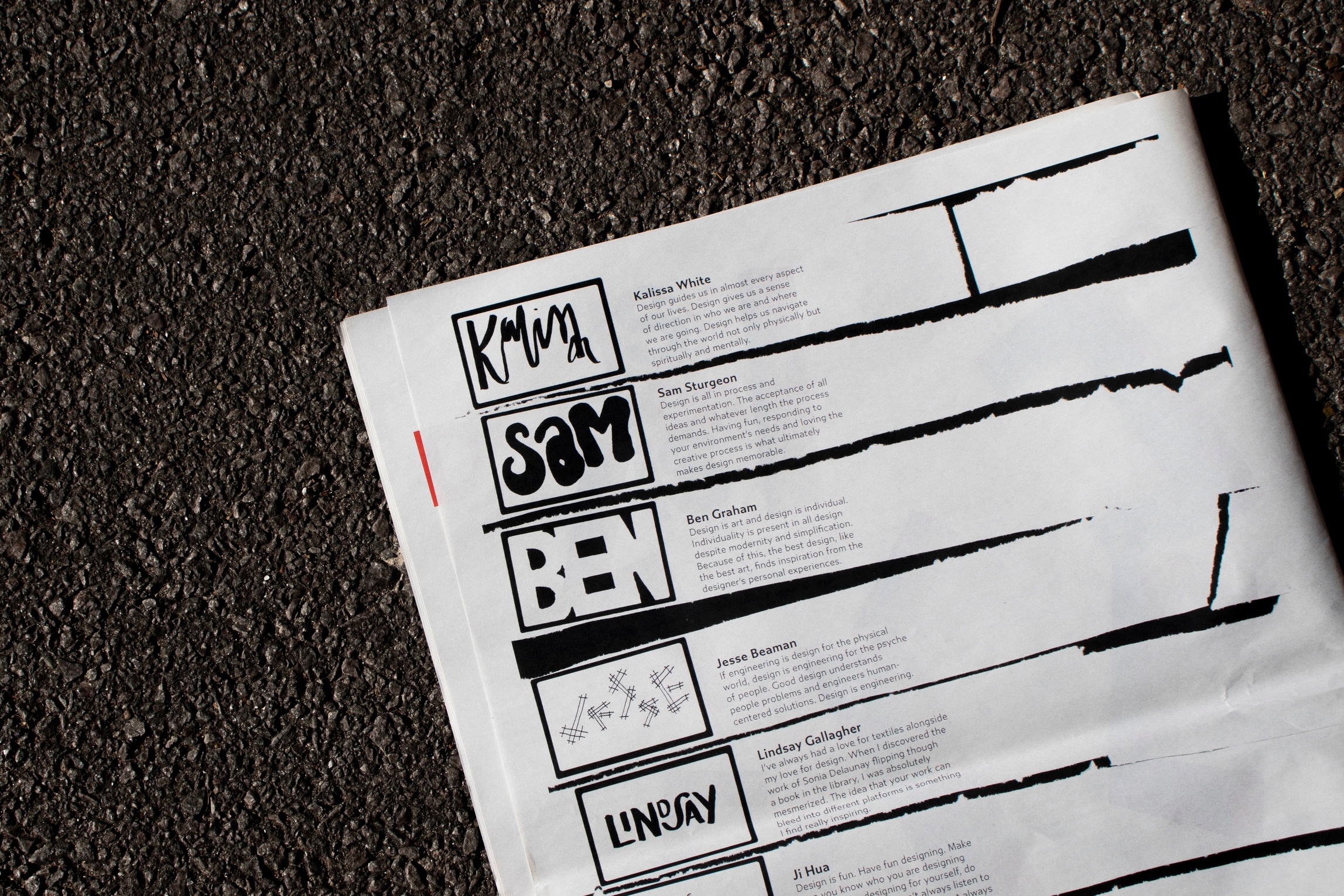
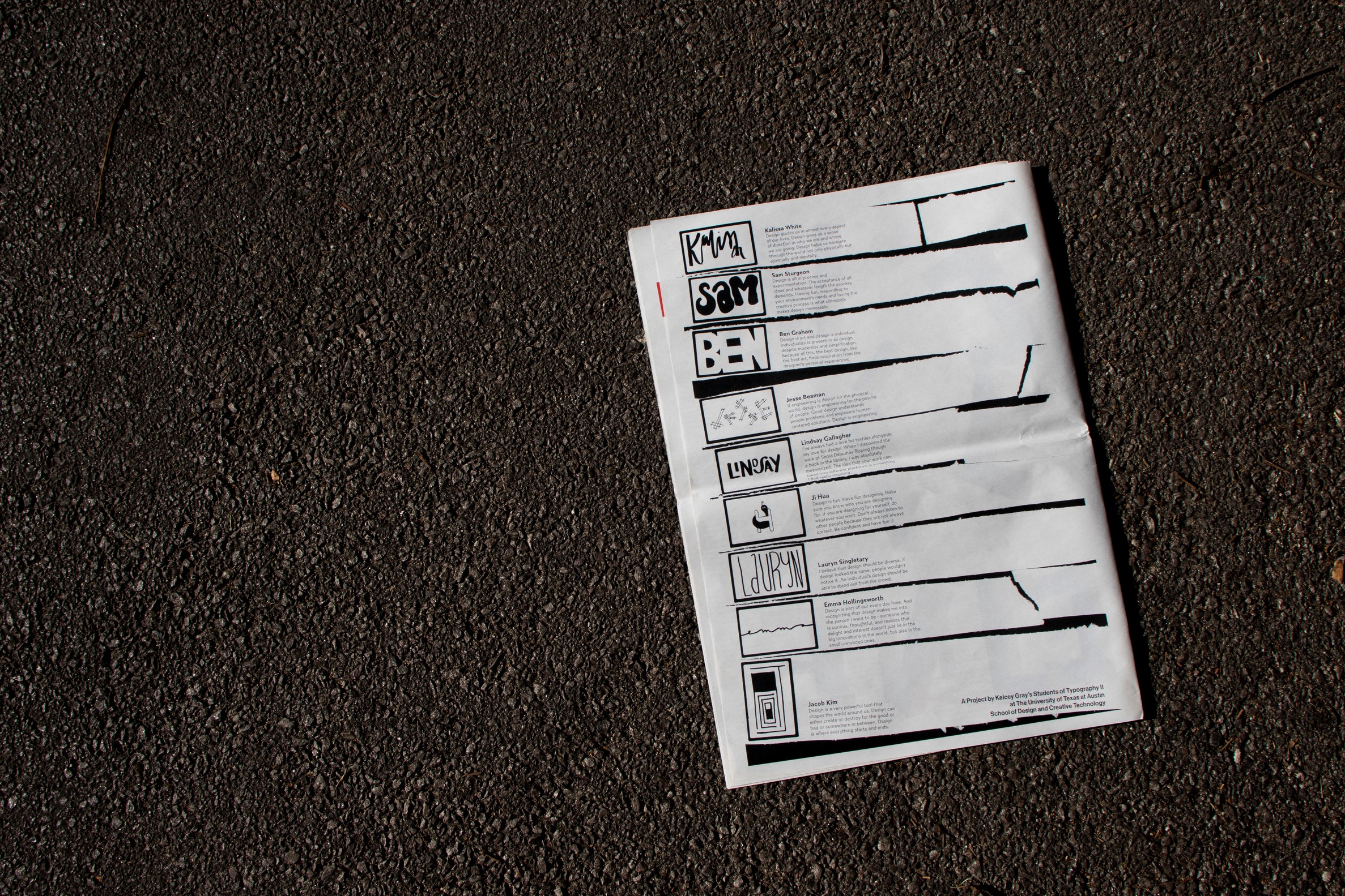
graphic design + print | spring 2019
design gives direction
Goal: Make a collaborative, printed manifesto publication through The NewsPaper Club. One page containing longform copy (research) and one page containing analog typography (lettering).
Research /
For this portion of the project, we were asked to pick a designer that we admire and research them and their work. I chose to focus on was the environmental graphic designer Deborah Sussman.
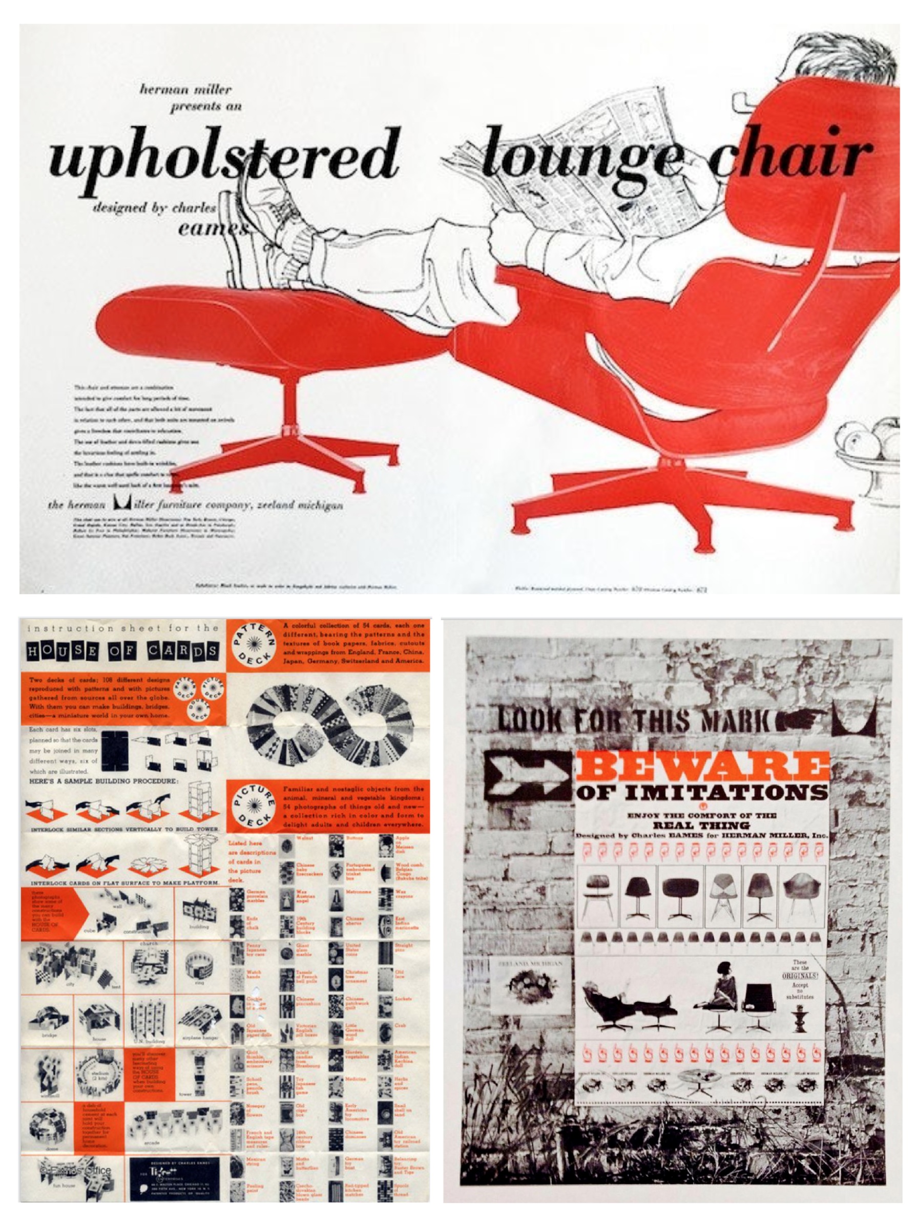
She worked in the Eames studio for ten years doing several different design-related jobs and tasks including art director for the office, designing print materials, museum exhibits, working on films and photography, and showrooms for furniture. Sussman’s most recognized work for the Eames’ was the card construction game House of Cards and her documentation of folk culture for the Eames’ film Day of the Dead (1957).
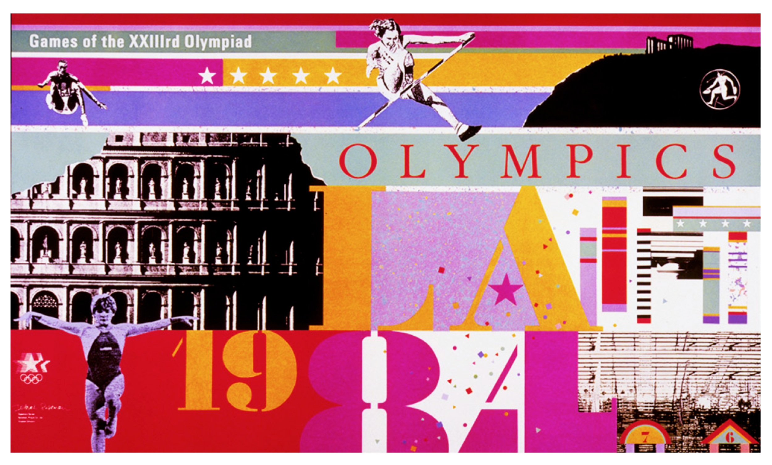
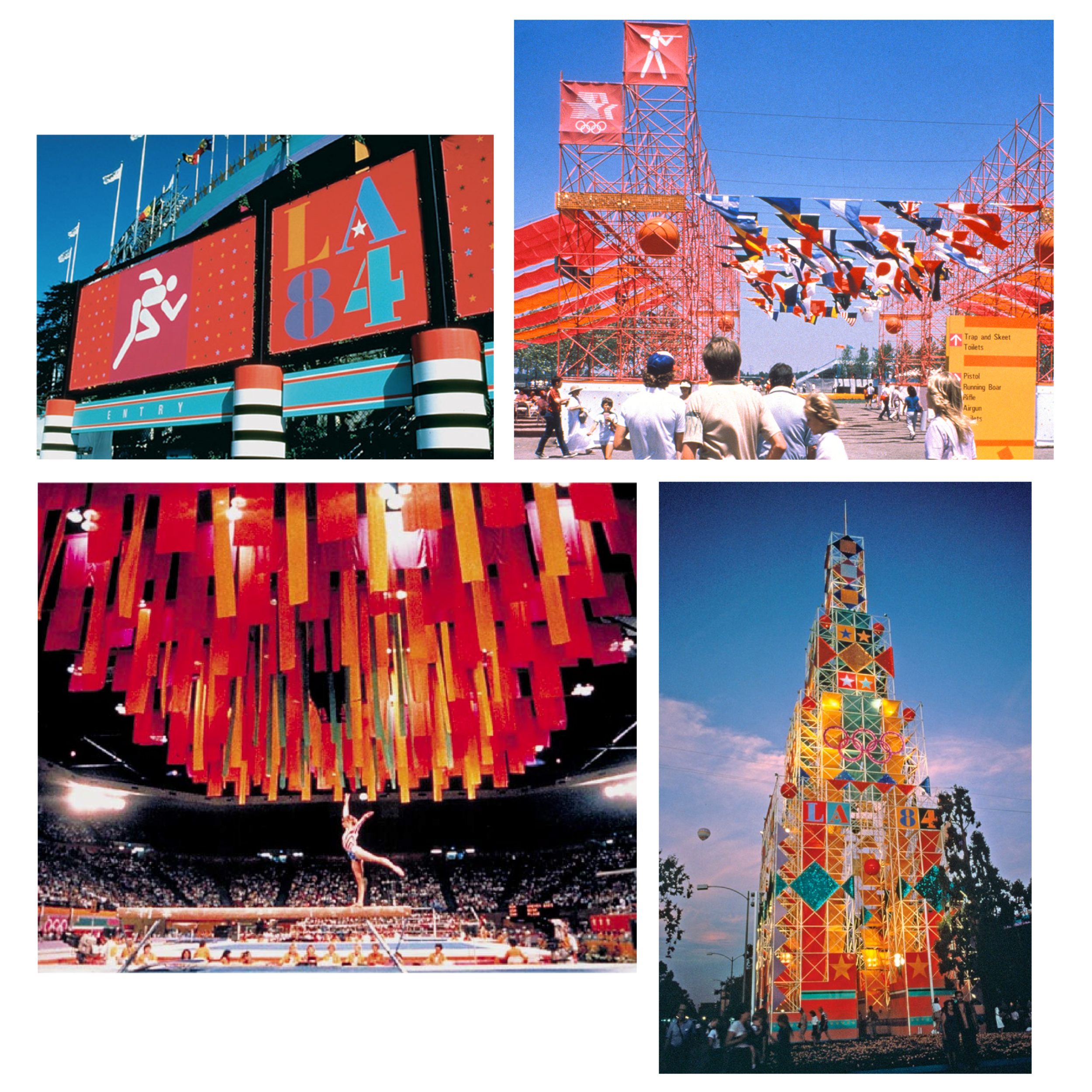
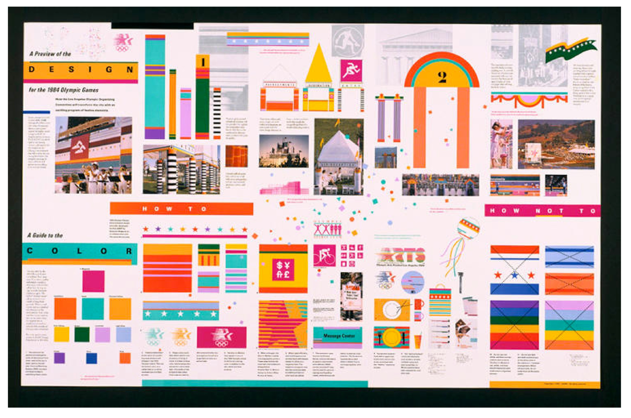
Once Sussman started her own firm with her urban planner/architect husband, Sussman/Prejza, she took on bigger projects such as the 1984 Olympics held in Los Angeles. Sussman/Prejza created pedestrian wayfinding signs, transportation signs, facility identification signs, and other graphics. The bright colors and geometric shapes utilized embodied the 1980’s Post-Modernism.
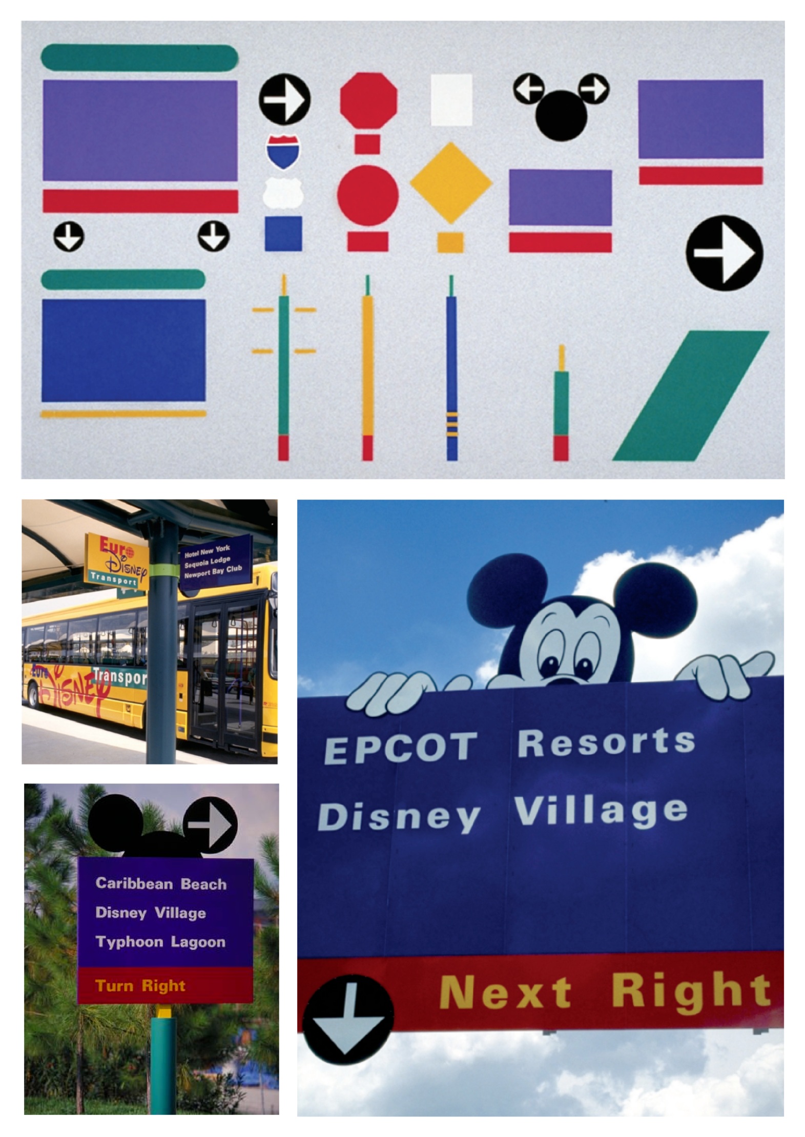
Sussman was also known for was for Walt Disney World and Euro Disney. The breadth of this project included wayfinding, signage, print materials and vehicular graphics/design. It was unique because of its playful qualities. Her work embodied the spirit and excitement one may experience on their way to Disney World through adding Mickey Mouse on the highway signs, using bright colors and consistent imagery.
The reason why I decided to research and learn about Deborah Sussman was because of the flare that I saw in her work that made wayfinding interesting visually as opposed to plain for the sake of getting from one place to the next. I thought that her work was memorable, entertaining, lively, and most importantly, bold.
Longform Copy /

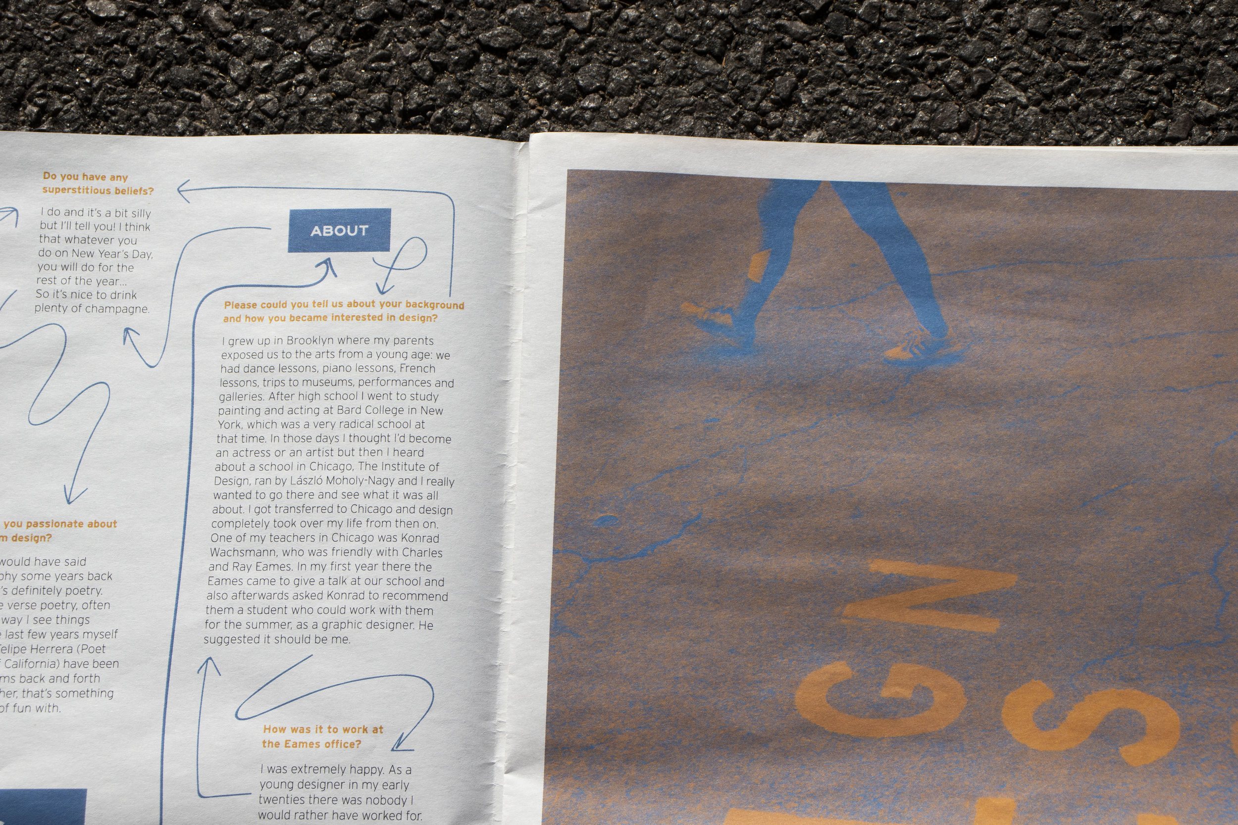
The purpose of this portion of the project was to find an article/interview about the selected designer and use all of the content to design a full-page layout that would be featured in the publication. The article chosen for the longform copy was a 2013 interview with Deborah Sussman conducted by designboom’s Andy Butler.
In order to create typographic hierarchy, different styles and typefaces for questions, answers, and quotes were used. In addition to that, heavier weights of the arrows signified branching out into initial sections.
The layout is fairly playful because of the spirit that existed in a lot of Deborah’s work. The arrows play into the essence of wayfinding in order to navigate through the content easier.
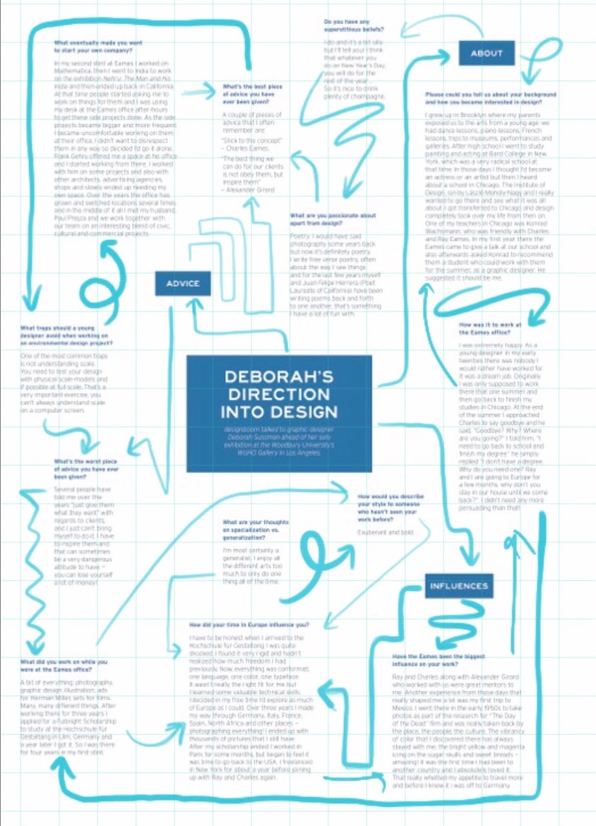
Iterations of the arrow placements can be seen below.
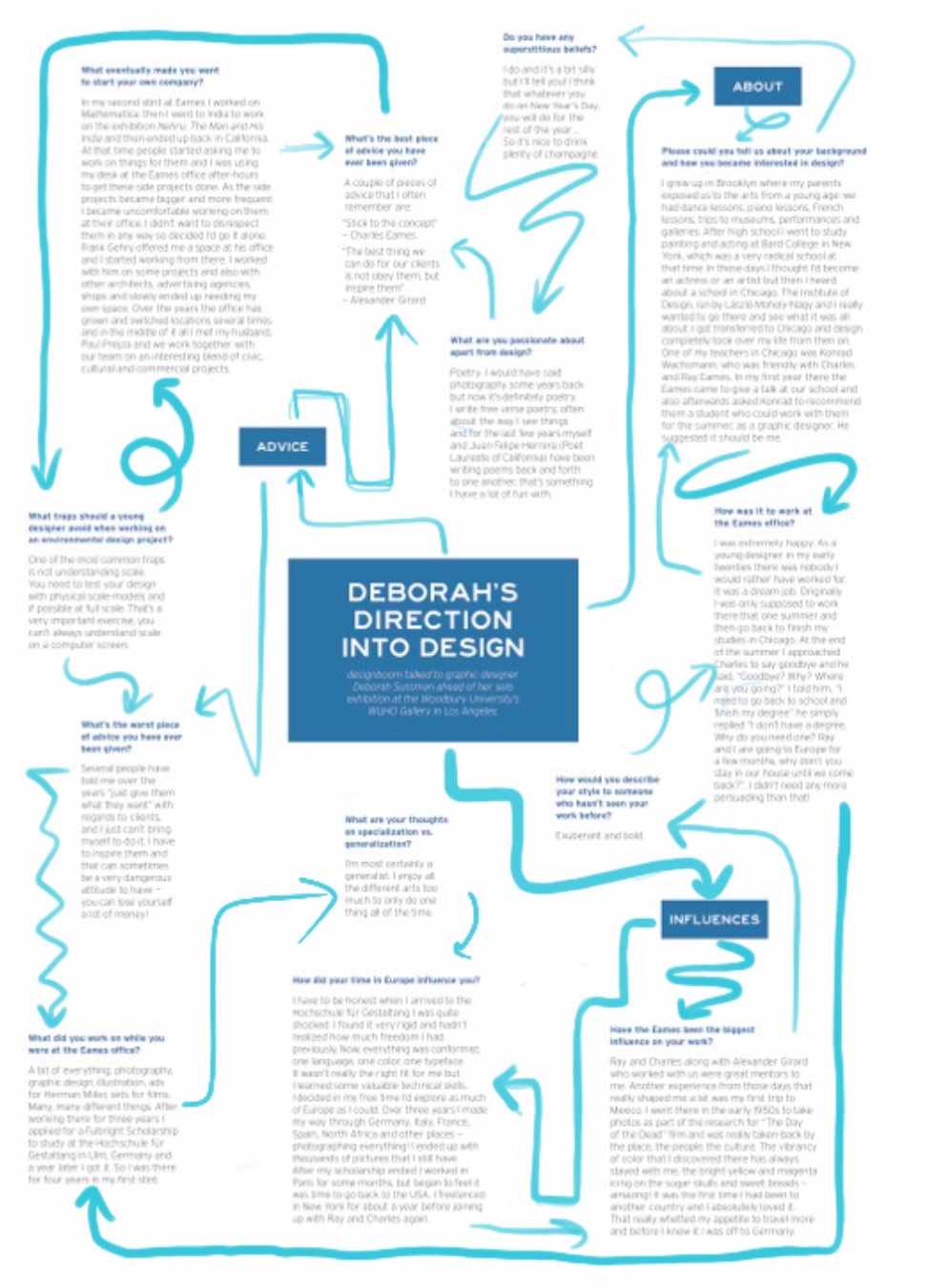
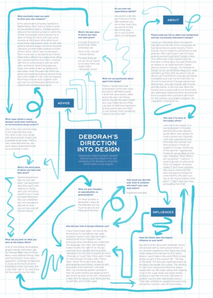
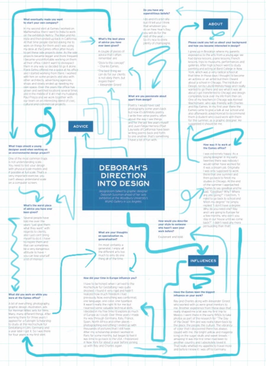
The flow of the arrows are all thought out, as one question/answer from the interview should relate to the next that are directed by the arrows. One of my challenges with this project was to group the similar answers but also be wary of the length of the answers with regards to the grid while also making sure the entire spread was balanced.
The final layout.

Analog Type /
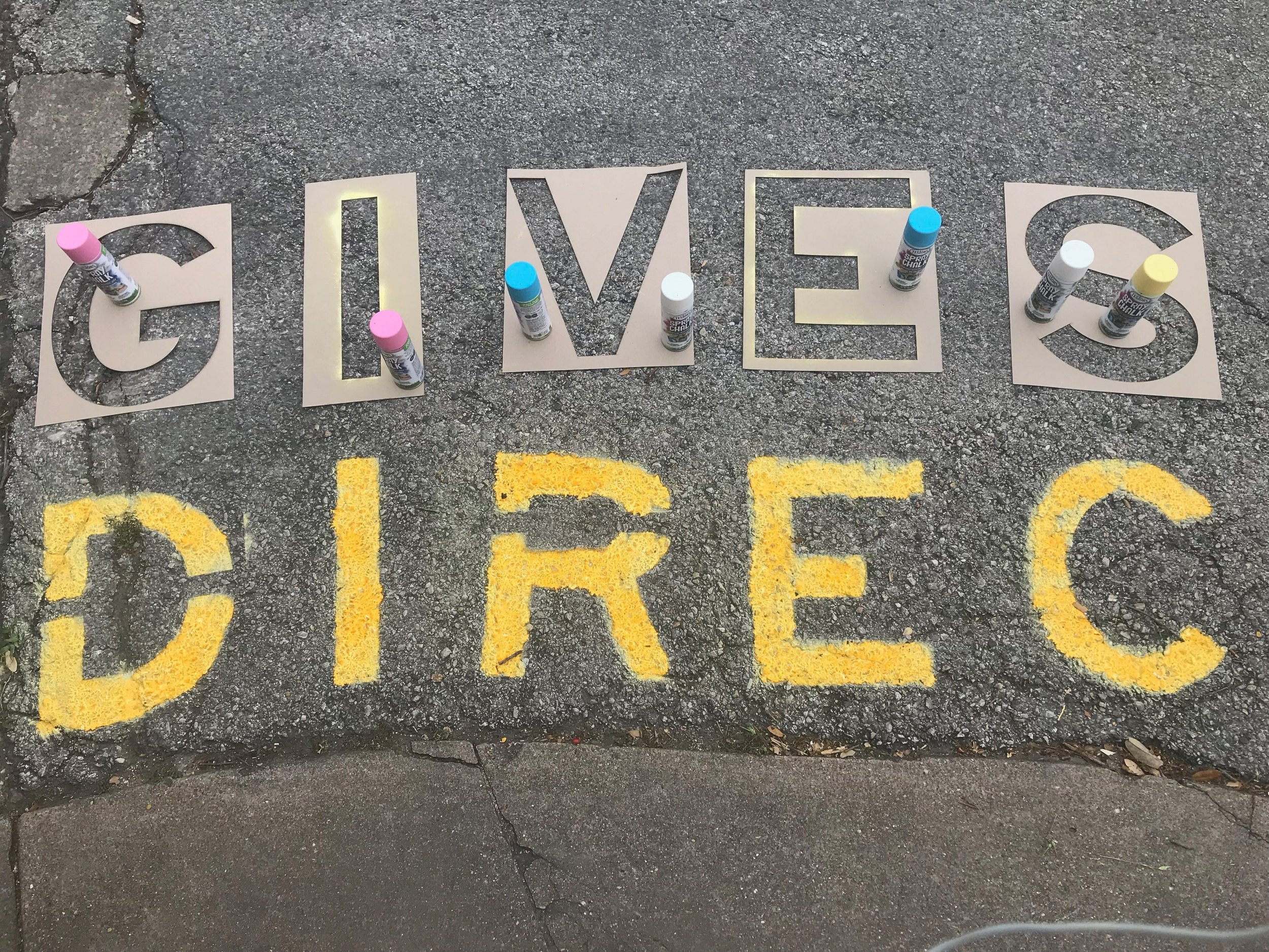
A Declaration (e.g. “Design is ____”) needed to be selected that align with the personality of the designer chosen. The Declaration that I decided to go with was “Design Gives Direction”. This seemed appropriate due to projects that Deborah typically took on having to do with wayfinding — all of her work instructed (or aided with) giving people directions. Inspired by Deborah’s work, it seemed fitting to do something related to giving someone directions or wayfinding, such as road surface markings/words.
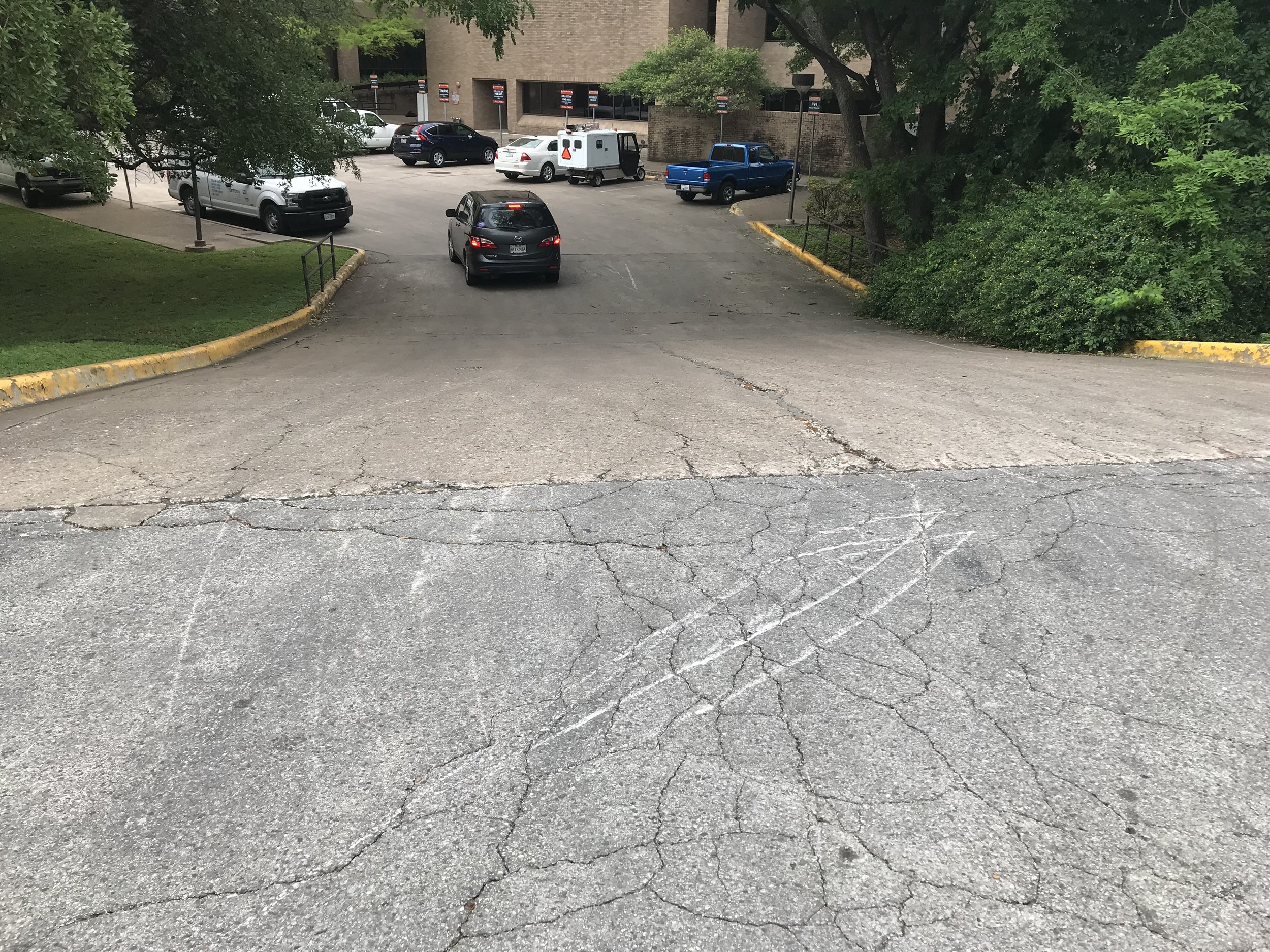
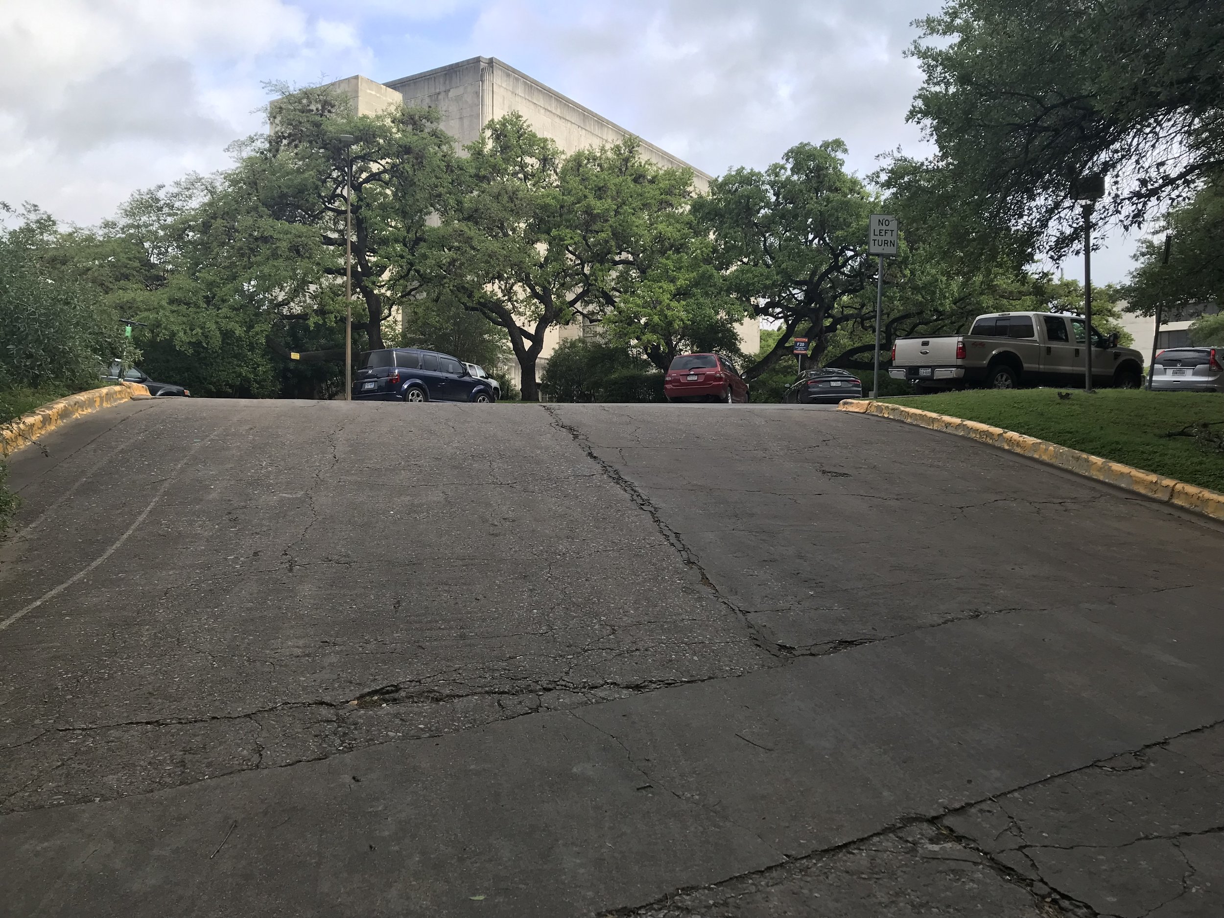
What I hoped to accomplish with my analog typography was to surprise those who read it because the phrase is not something typically seen on a roadway or sidewalk. Additionally, I wanted to work with the curves of a roadway because it gave more movement to the meaning of the words. Because the road is curved, that influences drivers to move their cars along the curve.
The site of the analog typography was located on Trinity Street, between the UT Austin Art Building and Doty Fine Arts Building on one of the side roads. I chose this site because it leads up to a winding one-way street where the driver would have to maneuver their car a certain way in order to gain more visibility of the road to turn. This particular area does not include any other signage besides a “No Left Turn” sign so I thought this would present an opportunity to catch attention.
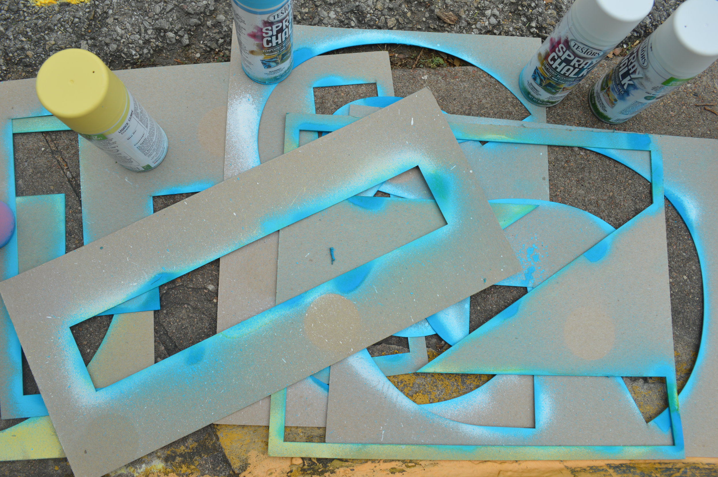
The next step was to construct stencils for the letters that I would spray chalk paint with on the road. The typeface I used for the letters was Highway Gothic which is the primary typeface on all public signage in the United States. After laser-cutting the selected letters out of chipboard, I mapped out where the letters would go alongside the curve in the road and sprayed it with the temporary chalk paint.
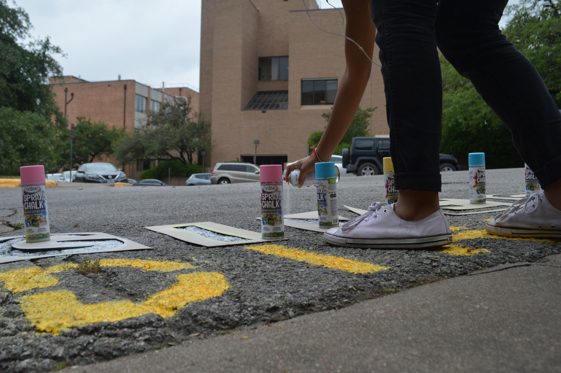
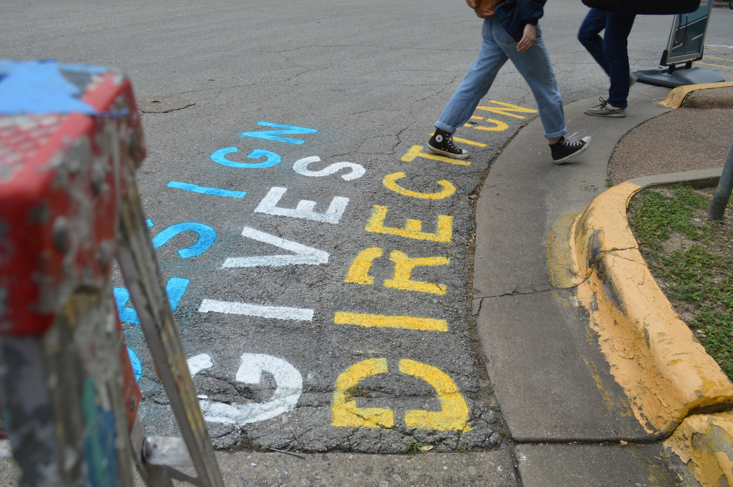
After doing this, I documented the interactions that people made with it and the parallelism made by drivers along the curve. Several pedestrians walked over the chalk letters and few cars drove over the letters but right next to it.


Newsprint /


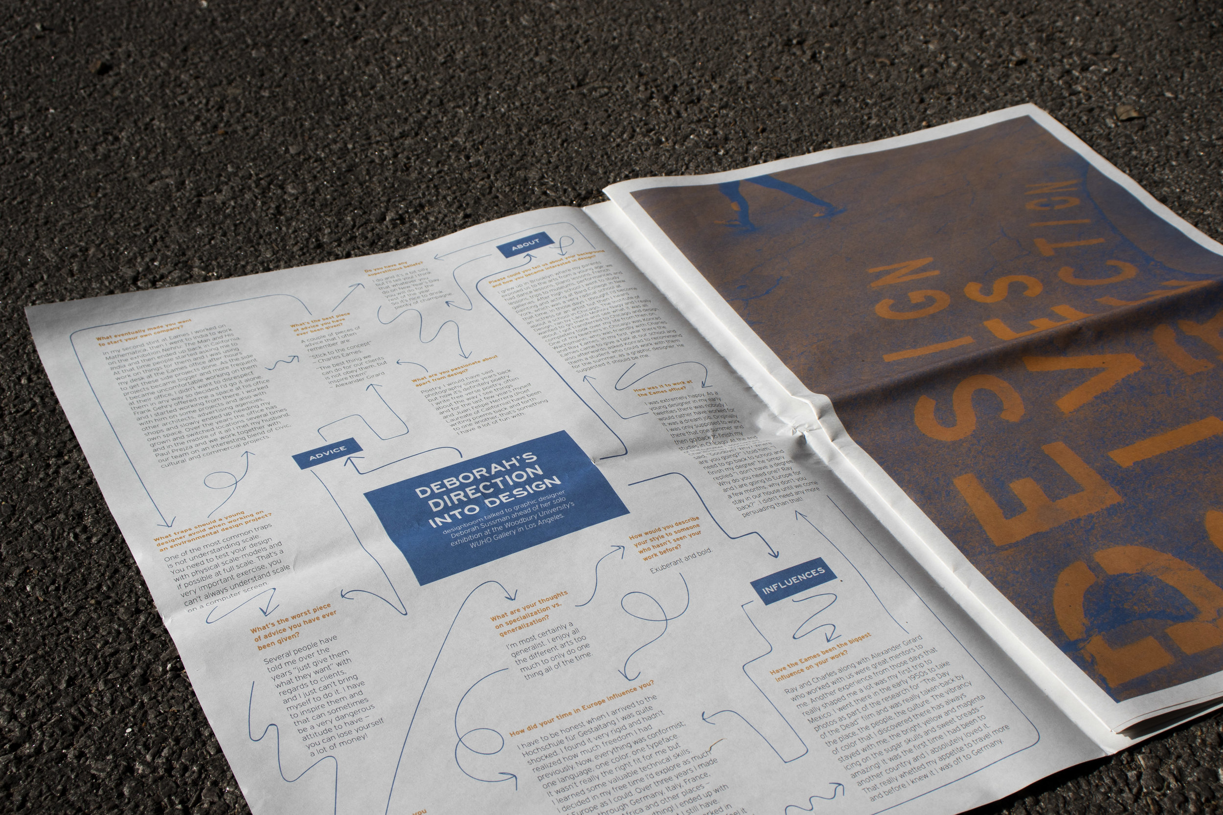
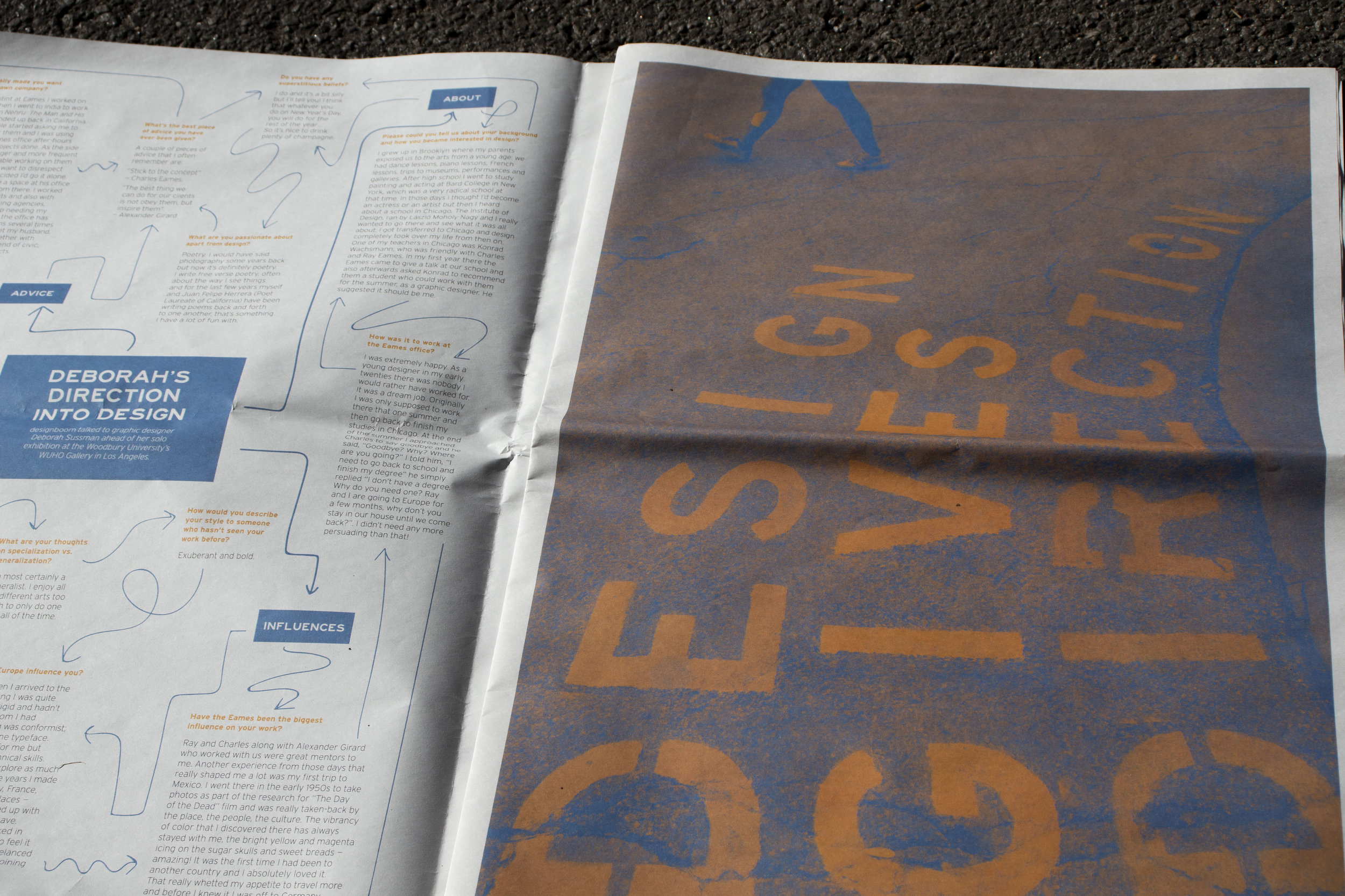


The color choices were blue and orange from the limited palette given for printing. Blue and orange were an ideal pair because they contrast one another. On the left side of the spread, the primary color used was blue and orange as the accent — the right side is the opposite, orange was the primary color and blue was the secondary color in order to maintain balance as a whole. Additionally, because the right side is a full-bleed photo, white space was utilized on the left in order to maintain visual balance.