
graphic design + print | fall 2018
ray eames
booklet + poster
Goal: create a poster and booklet that inspires the inclusion of an individual that has made significant contributions to the field of design but remains underrepresented in the canon of design history and design media.
Research /

Ray Kaiser, better known as Ray Eames, was a prominent American designer and artist. She is best known for his work with her husband, Charles Eames.
She worked with textiles, graphic design, filmmaking, painting and furniture design. A lot of her work is characterized by the bright and bold colors she uses.
The reason why I chose Ray Eames as the subject of my project was because of her partnership with her husband and the recognition that she rarely received. In the projects that she designed with her husband, it is evident what her influences were due to the inclusion of color and movement. I believe that her work stands out and added expression to a lot of their projects.

Booklet /
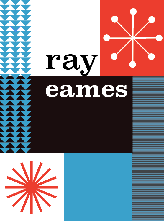
The goal of the booklet is to offer information with clarity and order. My personal goal was to communicate meaning through the relationship of text and image. The design of this booklet was greatly inspired by the general designs and graphic design of Ray Eames. Every element — the typefaces, colors, materials, and imagery — were all thoughtfully chosen with purpose.

The typefaces utilized were those that were prominent during the time in which the Eames were designing. A Clanderon typeface was utilized on the cover and for the primary text because of its use in their work. The secondary type used was Bodoni.
The colors used in this booklet were all influenced by the colors that Ray Eames often used in her work. Inspired by the Arts and Architecture magazine covers and the color-blocking of the Case Study No. 8 House, the primary colors of red and blue were used accompanied by black and white. The photos in this booklet were all black and white and printed on off-white paper to give the impression that the booklet was aged from the time the Eames were working during and after World War II.


This booklet was printed on a manila-colored paper to give the impression that it was aged around the time that the Eames may have been working. The dimensions of this booklet are 6.75”x5.5” and it is based on a 4x4 grid. The structure of this grid is important because every element aligns to it in ode to the Case Study No. 8 House’s gridded facade.

Poster /
The purpose of this poster was to mashup the qualities inherent of the protest poster with that of Ray Eames’ work. The message of “protest” that this communicates is the awakening of representation.
There are two components of this poster: the imagery is the Eames logo which is the motif of a sun, and Ray’s name. The sun icon was chosen because it is iconic for the brand but it also has strong symbolism. The word ray was used because it was her name but also because of the meaning behind the word.

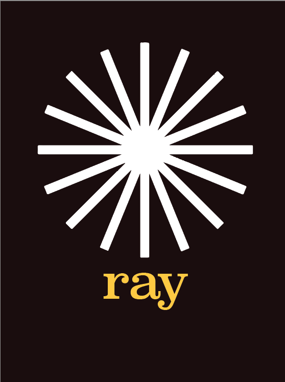
ray
/rā/
noun: each of the lines in which light may seem to stream from the sun or any luminous body, or pass through a small opening.
It was as if Ray was standing in the background for so long and it is her time to shine. She is coming out of the background and is now center-stage. The sun is radiating out of the bright background represents Ray as a person. Her name including the period at the end was to emphasize that it was just her, and no one else. Her name has always been linked to that of her husband’s and there was a need for separation.


The typeface used was Clanderon. This was chosen in order to keep the type consistent with the booklet.
The bright yellow color was utilized in ode to the colors that Ray Eames often used.
