
graphic design + illustration | spring 2019
josephine baker monogram + business cards
Goal: use the context of a monogram to encapsulate the character of that individual through use of typographic form; then translate that monogram into a business card for that individual.
Inspiration /
Research /

Josephine Baker was a prominent Black figure in the 1930s. She was known for her singing and dancing performances in Europe, especially in Paris, France.
She made significant contributions towards the representation of Black women in society across the world. She was one of the first Black women to star in major films (Zou-Zou and Princesse Tam-Tam), various comical skits, and go on tour during a time when racism and segregation was still prominent in society.
The reason why I chose Josephine Baker as the subject of my project was due to her multi-faceted career and the cultural impact she made. She was often overlooked due to her physical appearance and stereotypes but not recognized for all of the work she did.
“You know, friends, that I do not lie to you when I tell you I have walked into the palaces of kings and queens and into the houses of presidents. And much more. But I could not walk into a hotel in America and get a cup of coffee, and that made me mad.” — Josephine Baker
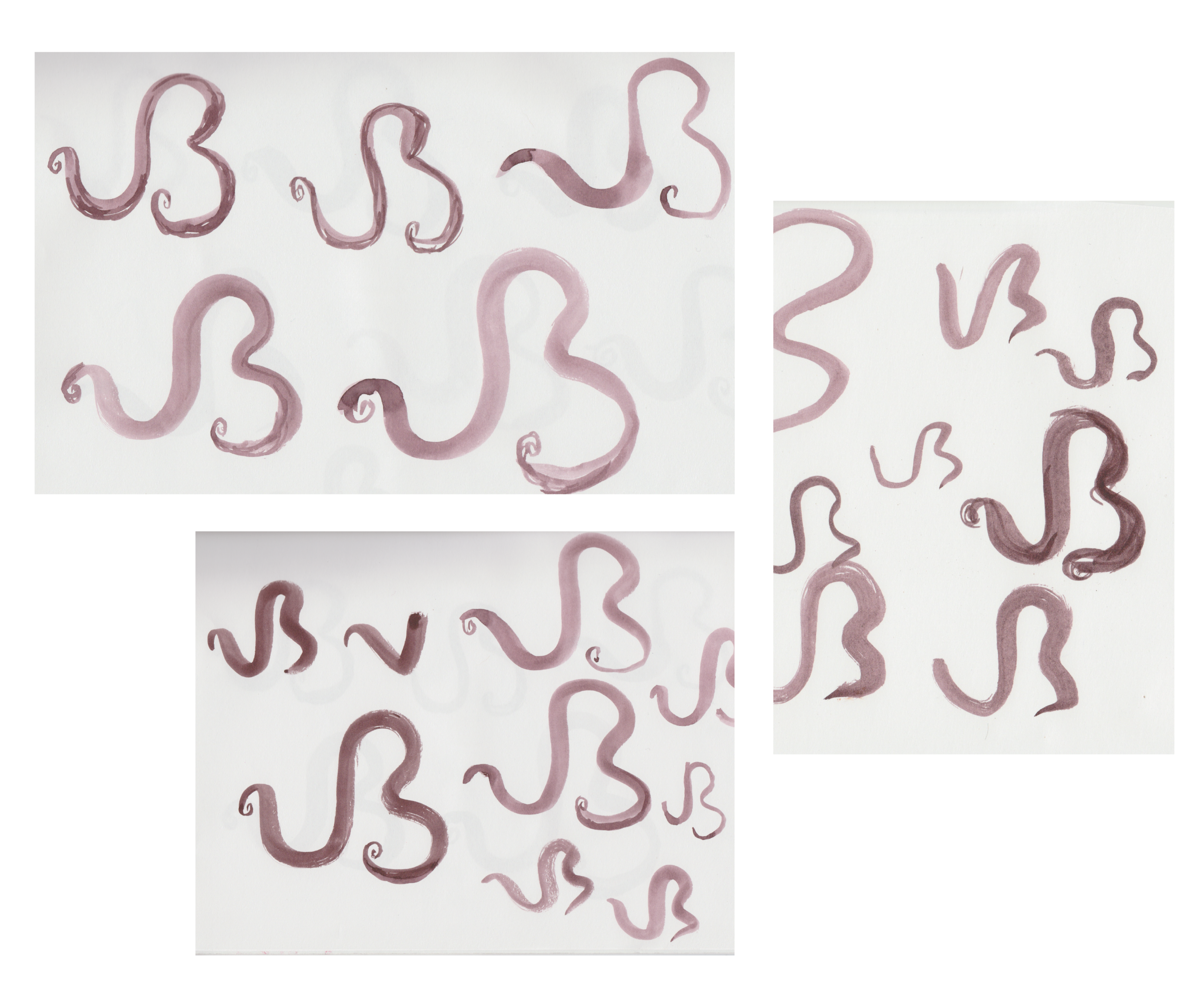
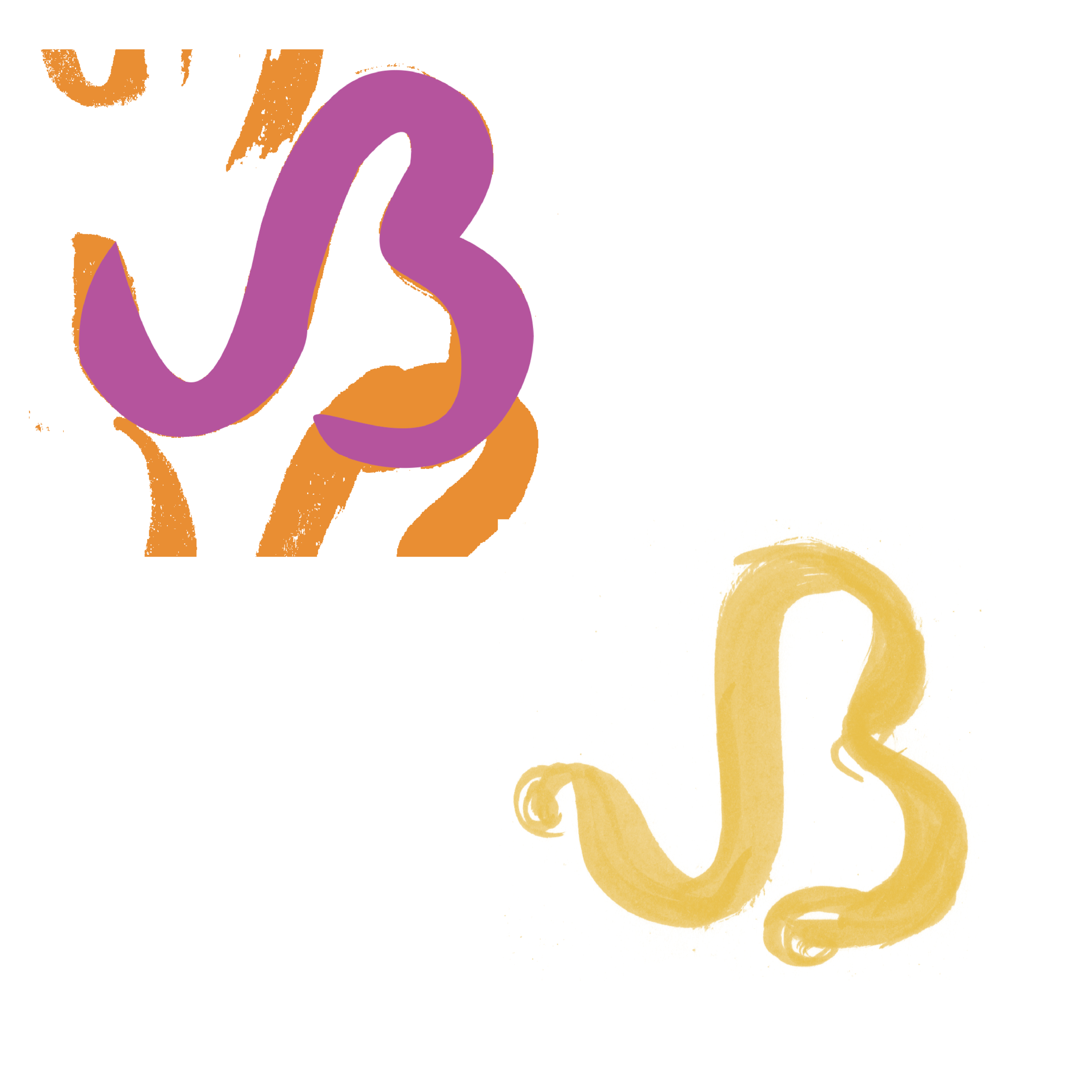
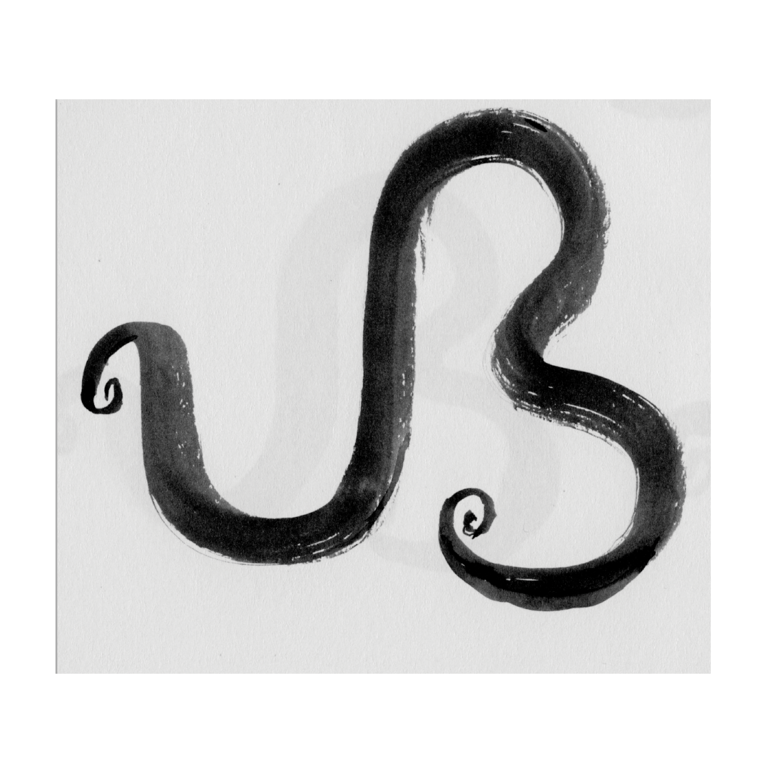
Part 01: Monogram /
The concept behind this monogram was a continuous line that was inspired by Baker’s signature curls. The organic form was also influenced by Baker’s flowy and free movements represented in her performances and clothing. In order to mimic the essence this form, watercolor brush pens were utilized and scanned.


Part 02: Business Card /
Inspired by show posters and photos of Baker’s costumes, these bright colors were for in the business cards.
I decided to utilize DK Otago for the primary typeface and the secondary typeface was Mostra Nuova. These typefaces seemed fitting because they were Art-Deco styled and looked similar to one another but with slight distinctions.

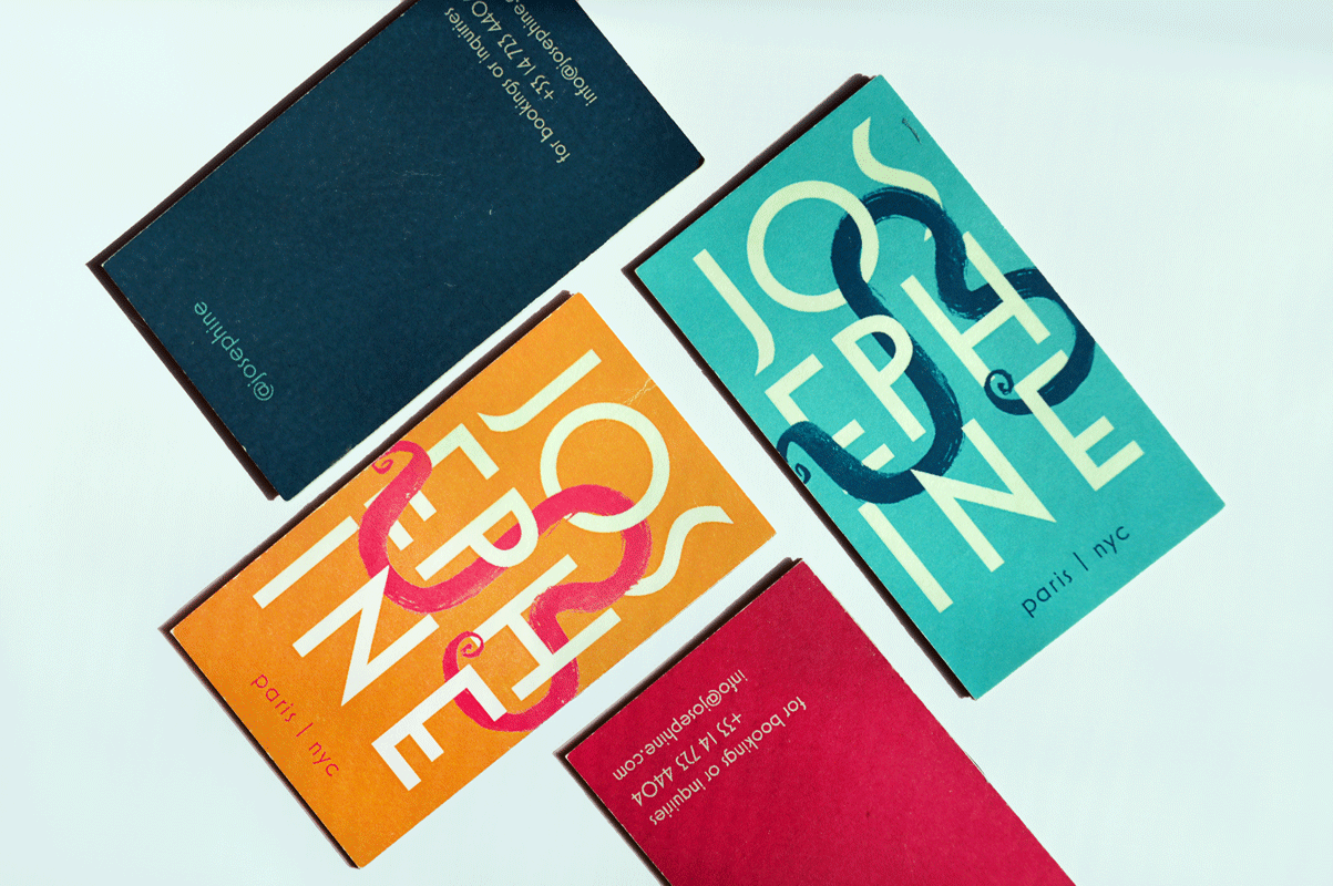
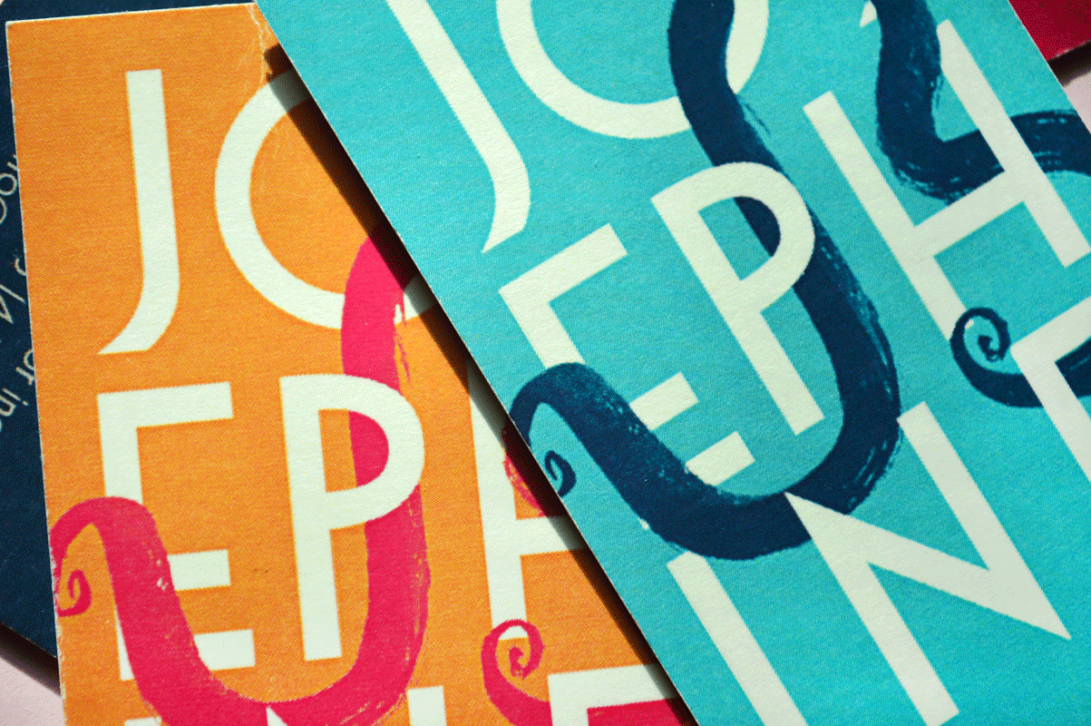

The monogram was integrated into the structure of the letters to make both pieces connected.